

Neutral vs. Bold Paint Colors: Which Is Right for Your Home?

Choosing a paint color for your home’s interior can feel incredibly high-stakes. You walk into the home improvement store looking for a simple can of paint and walk out buried under forty different shades of “off-white” and “slate blue,” feeling completely overwhelmed.

The ultimate design battle usually comes down to two distinct philosophies: Classic Neutrals versus Fearless Bolds.

Neither choice is inherently right or wrong, but the wrong choice for your specific lifestyle and architecture can leave your home feeling either incredibly boring or completely chaotic. Here is how to break down the pros and cons of each camp to find the perfect fit for your walls.

The Case for Classic Neutrals

Neutrals have evolved way beyond the sterile, sterile apartment “builder-beige” of the early 2000s. Modern neutrals include rich greiges, warm ivories, soft taupes, and sophisticated earthy tones.
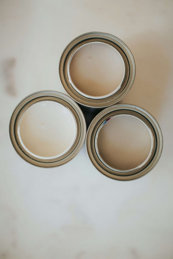
The Pros:

  • Maximized Light and Space: Light neutrals reflect illumination rather than absorbing it. If you have a small room or a space with limited windows, a soft neutral color instantly makes the area feel larger, airier, and more open.
  • Ultimate Design Flexibility: Neutrals act as a blank canvas. If you paint your living room a soft cream, you can change your couch, pillows, rugs, and art three times over the next decade without ever having to pick up a paintbrush again.
  • Broader Resale Appeal: If you plan on selling your home within the next few years, neutrals are statistically proven to help buyers visualize themselves in the space, leading to faster sales.

The Cons:

  • Can feel impersonal, cold, or generic if you don’t layer the room with plenty of textures (like wood, woven baskets, and fabrics).
classic neutral colors

The Case for Bold Colors

Bold paint colors—like deep emerald greens, moody charcoals, rich navy blues, and dramatic terracotta—are all about creating an immediate emotional experience when you walk into a room.

The Pros:

  • Instant Character and Architectural Interest: If your home is a standard “cookie-cutter” build without historic crown molding or unique features, a bold wall color provides instant architectural weight and personality.
  • Cozy, High-End “Mood”: Darker, bolder colors pull walls inward visually, creating a dramatic, intimate “jewel-box” effect. This makes them incredibly successful in bedrooms, formal dining rooms, home offices, or media rooms.
  • Hides Imperfections: Interestingly, flat dark colors can actually camouflage minor dings and uneven texture in old drywall better than light, reflective colors.

The Cons:

  • They absorb light, meaning a poorly lit room can quickly start to look like a cave.
  • They are notoriously difficult to paint over later, often requiring multiple coats of high-hiding primer.
bold paint colors

The Ultimate Head-to-Head Comparison

Room Characteristic

Choose Neutrals If…

Choose Bolds If…

Natural Light

The room is naturally dark or north-facing.

The room is flooded with bright, southern sunlight.

Room Purpose

It’s a high-traffic, multi-use space (Kitchen/Living).

It’s an intimate, dedicated space (Office/Powder Room).

Your Furnishings

You own colorful, eclectic furniture and art.

Your furniture is simple, minimalist, or neutral.

Your Timeline

You plan to sell the home in the near future.

You intend to stay and want a deeply personal space.

Why Choose? How to Get the Best of Both Worlds

If you love the drama of bold colors but are terrified of turning your home into a dark dungeon, you don’t have to choose just one. You can blend the two strategies seamlessly:

  • The 60-30-10 Rule: Design your room using 60% of a dominant neutral color (walls), 30% of a secondary color (furniture and curtains), and 10% of your favorite bold color via an accent wall, painted interior doors, or decor.
  • The “Fifth Wall” Strategy: Keep all four walls a crisp, clean neutral, but paint the ceiling a bold, unexpected color.
  • The Powder Room Experiment: Powder bathrooms and laundry rooms are perfect “low-risk” testing grounds for bold colors. Because they are small and enclosed, you can go completely dramatic without impacting the flow of the rest of the house.